This is an unofficial archive of PsychonautWiki as of 2025-08-11T15:14:44Z. Content on this page may be outdated, incomplete, or inaccurate. Please refer to the original page for the most up-to-date information.
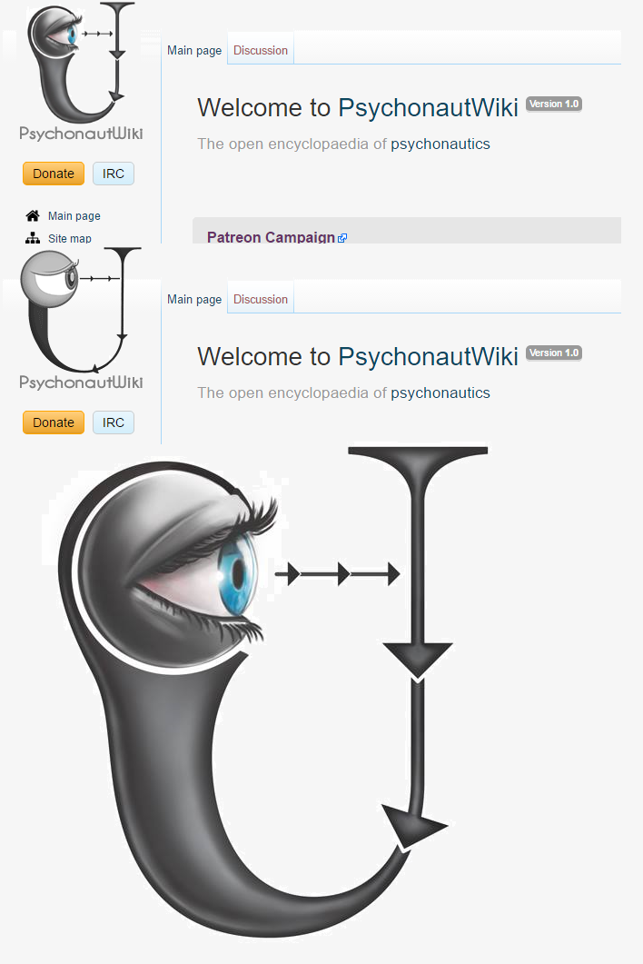
Ok guise so we are getting a new realistic animated high res logo thanks to my friend. The first draft is below. This page will to list potential nitpicks and improvements on the aesthetics, shape, layout etc before it is realistically animated.
Please list potential improvements below:
Eye should be a tad bigger relative to the U shape
left hand side of U should be skinnier and less fat
shading should on U should be a tad less shiny/intense particularly on arrows and right hand side
We need a new more readable font, maybe this one: here
might be cool if there was a variation with subtle geometry on the U